
Simplifying Investment Discovery & Tracking
Company
CBM
Timeline
2024-Present
Platforms
Web · iOS · Android

Overview
I redesigned the Investments section of a mobile banking app to make investment products easier to discover, understand and manage.
The new experience separated product discovery from portfolio management, simplified navigation, and introduced dedicated experiences for users at different stages of their investment journey.
Business Context
The bank offered multiple investment products, but most customers interacted with only a small part of the available offering.
Internal data showed that around 95% of mass-segment users relied on only one investment product, while adoption of additional products remained below 1%.
For the business, this meant that a broad investment offering was not translating into product adoption. The redesign aimed to improve discoverability and create more opportunities for customers to explore relevant investment products.
Key Metrics
Adoption of editional investment products
My Role
As the Product Designer, I worked on the experience from research and structural exploration through to the final UI.
I:
mapped existing investment-related user flows;
analyzed the current information architecture and key pain points;
conducted competitor research;
redesigned the information architecture of the Investments section;
defined different experiences for new and existing investors;
designed portfolio, product discovery and onboarding flows;
worked through multiple product and onboarding states;
created the final mobile UI and interactive scenarios.
Problem
Despite having a dedicated Investments section, the experience did not help users understand the full range of products available to them.
Product discovery and portfolio management existed within the same structure, making navigation unclear and creating unnecessary complexity.
For existing investors, the section did not provide a clear overview of their investment products and balances. For users without investments, there was no focused entry point that helped them understand what products were available or where to start.
As a result, customers tended to remain within the one or two products they already knew.
Task
Redesign the Investments section to:
make available investment products easier to discover;
separate exploration from portfolio management;
create relevant entry points for both new and existing investors;
make balances and product statuses easier to understand;
support different onboarding and product states;
create a scalable structure that could accommodate additional investment products in the future.
Approach
Mapping the Existing Experience
I started by mapping investment-related flows across the mobile banking app to understand how users entered the section, discovered products, opened them and returned to manage existing investments.
This helped identify where different scenarios were competing within the same experience and where the information architecture created unnecessary friction.

Competitive Analysis
I analyzed how other financial products structured investment discovery and portfolio management, focusing on navigation patterns, product presentation and the separation between existing assets and new opportunities.
Rather than reproducing individual patterns, I used the research to identify common mental models that could simplify the existing structure.

Separating Two User Scenarios
One of the key decisions was to distinguish between users who already had investment products and users who did not.
For new users, I designed a discovery-focused experience that introduces available investment products and helps them understand where to start.
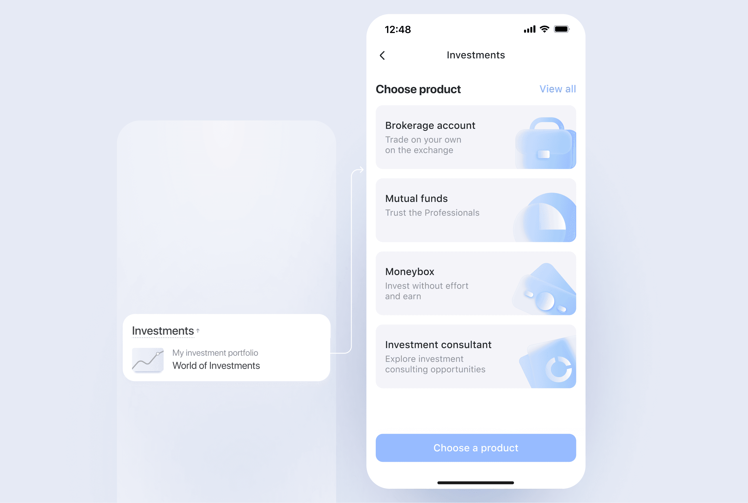
For existing investors, I created a portfolio-focused experience where balances, products and their current states receive priority, while additional products remain accessible for further discovery.

Building a Scalable Product Structure
I reorganized the section around clearer product categories and designed the system to support different investment products, balances, onboarding stages and connection statuses.
I also designed additional screens for intermediate and product-specific states so that users could understand not only what products were available, but also where they were in the process of opening or using them.

Outcome
The redesign resulted in a new information architecture for the Investments section, separating two previously mixed user needs: managing existing investments and discovering new products.
The final solution introduced:
a dedicated discovery experience for users without investments;
a portfolio-focused experience for existing investors;
clearer visibility of additional investment products;
dedicated states for different onboarding and product scenarios;
a scalable structure that could accommodate new investment products without restructuring the entire section.
The project delivered a complete end-to-end design ready for implementation.
Expected Impact
The redesigned experience was intended to increase adoption of additional investment products, which remained below 1% in the mass segment.
By making the broader investment offering more visible and creating clearer paths from discovery → exploration → product opening, the new structure aimed to encourage customers to move beyond the one investment product they already used.
Post-launch metrics were not available within the project timeframe.
Next case
Driving Review Engagement